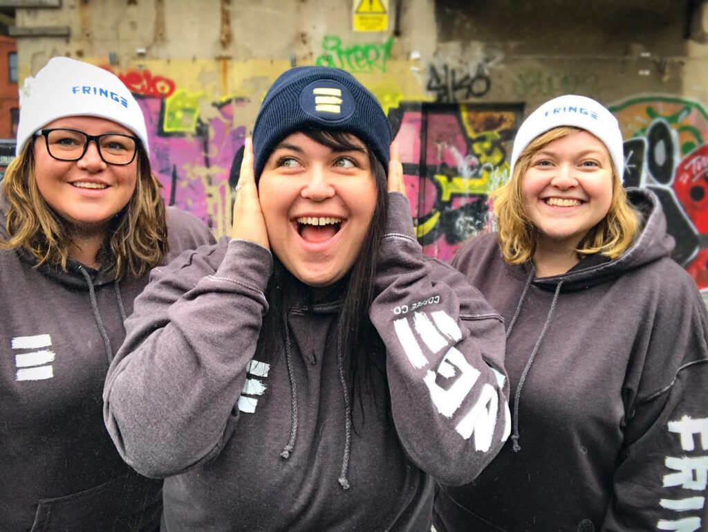
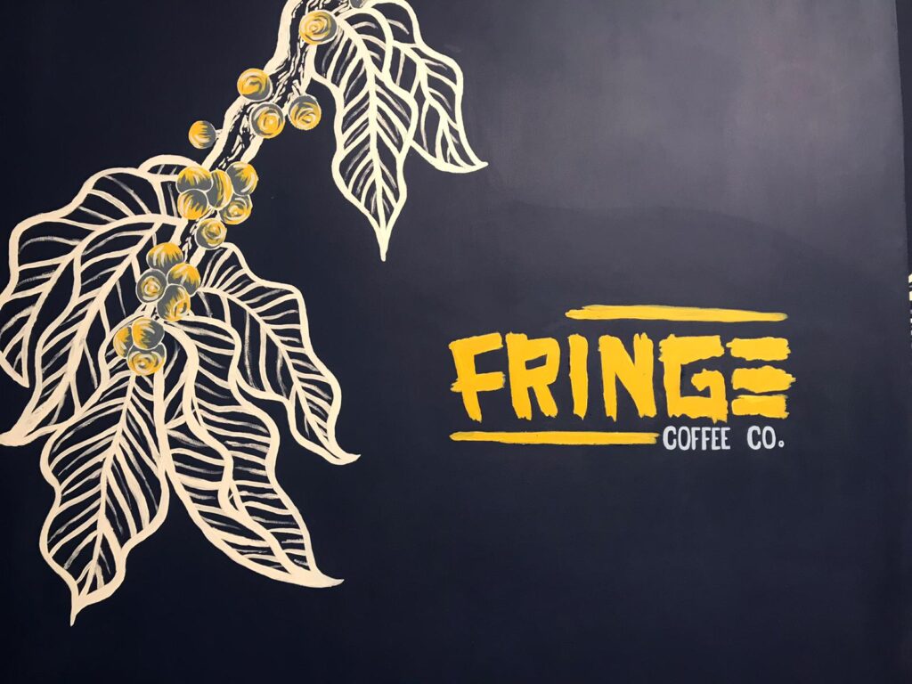
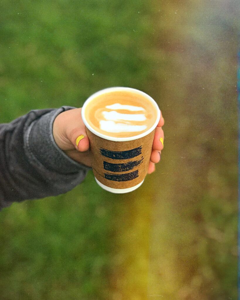
Fringe Coffee Co. is a social enterprise company with a mission to help empower people on the fringes of society through coffee. We worked together to create a logo that would represent their mission and growing business.
Logo | Visual Development | Packaging
The Fringe team was tired of the typical coffee shop trend of clean, modern Swedish design. They wanted something creative, future-seeking, and alternative.
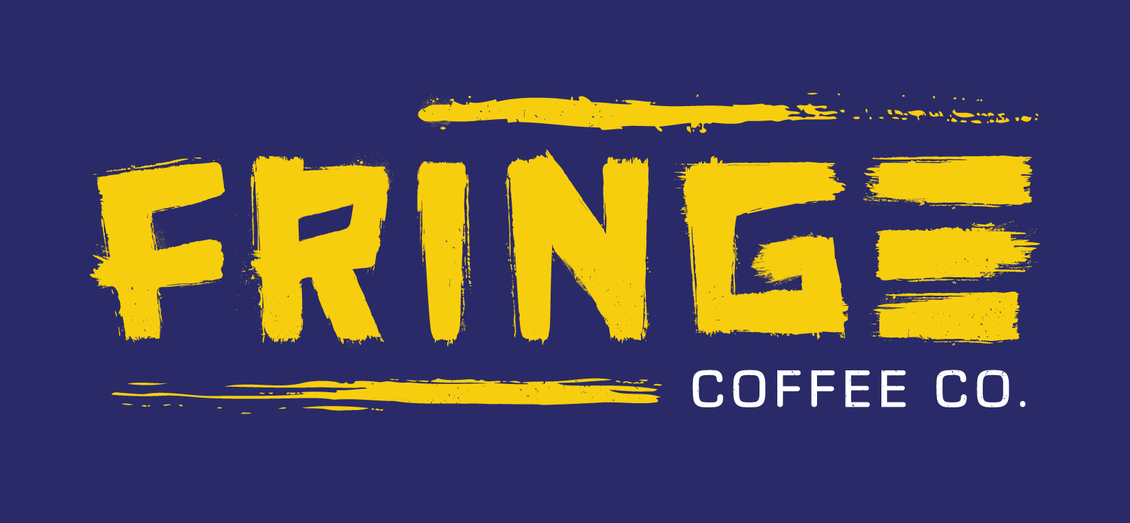
Main Fringe Logo with Color Variations
The Fringe team wanted a logo that was bold, edgy, and “a little crazy.” A logo that could grow with them and suggested bringing folks on the fringes into a safe environment of growth and creativity.

Alternative Logo Marks – “The Freaky E”


During development, the Fringe team shared that they needed a “freaky E,” the term they’d coined for a style of ‘E’ made up of three lines stacked upon one another.
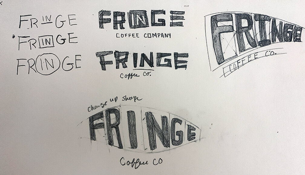
Logo + Identity
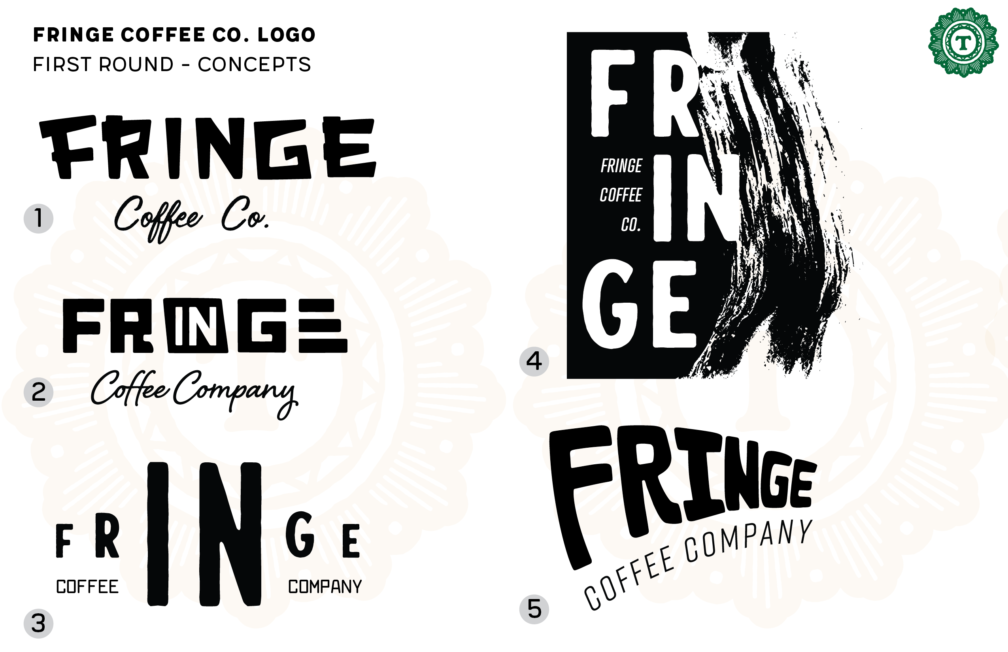
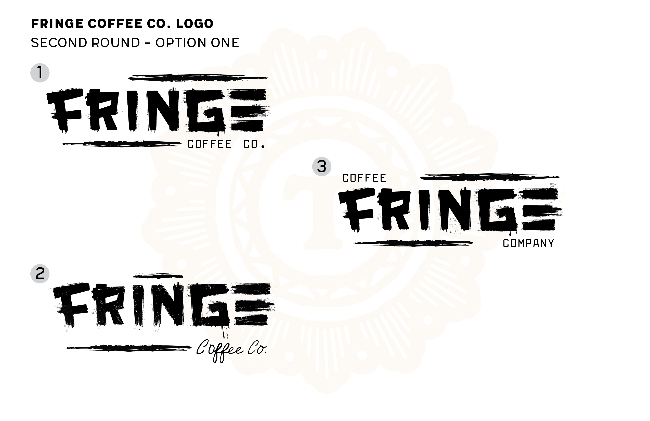
The Fringe team wanted a logo that was creative, and a little grungy. Initially, I kept the concepts clean to focus on the structure, adding the distressed treatment in later, resulting in a recognizable logotype.
Packaging
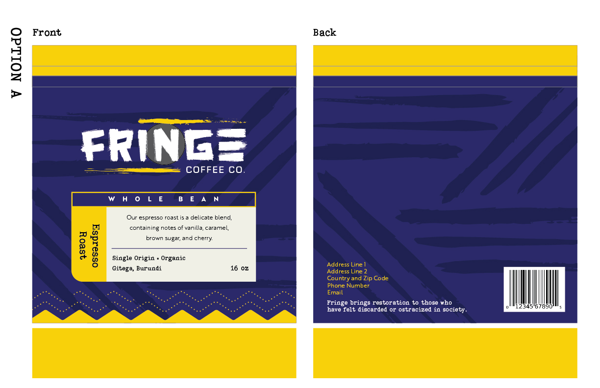
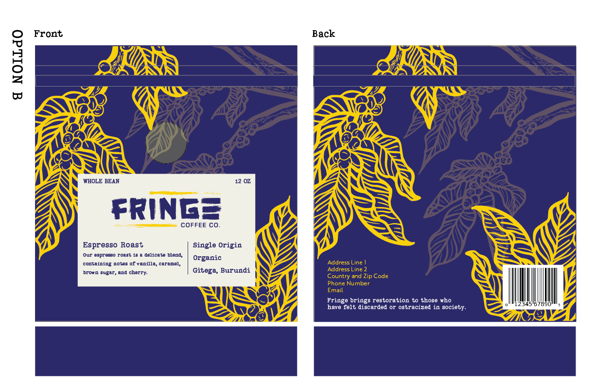
In need of a flexible packaging solution, we decided on a bag design with interchangeable labels. Icons and colors were used to differentiate between the blends and help to identify the difference when displayed together.
