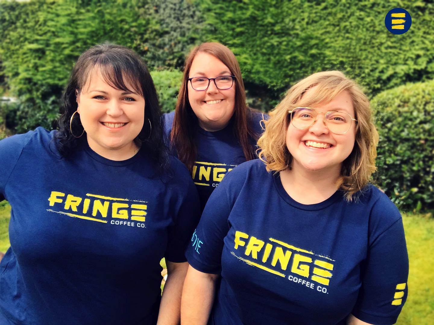
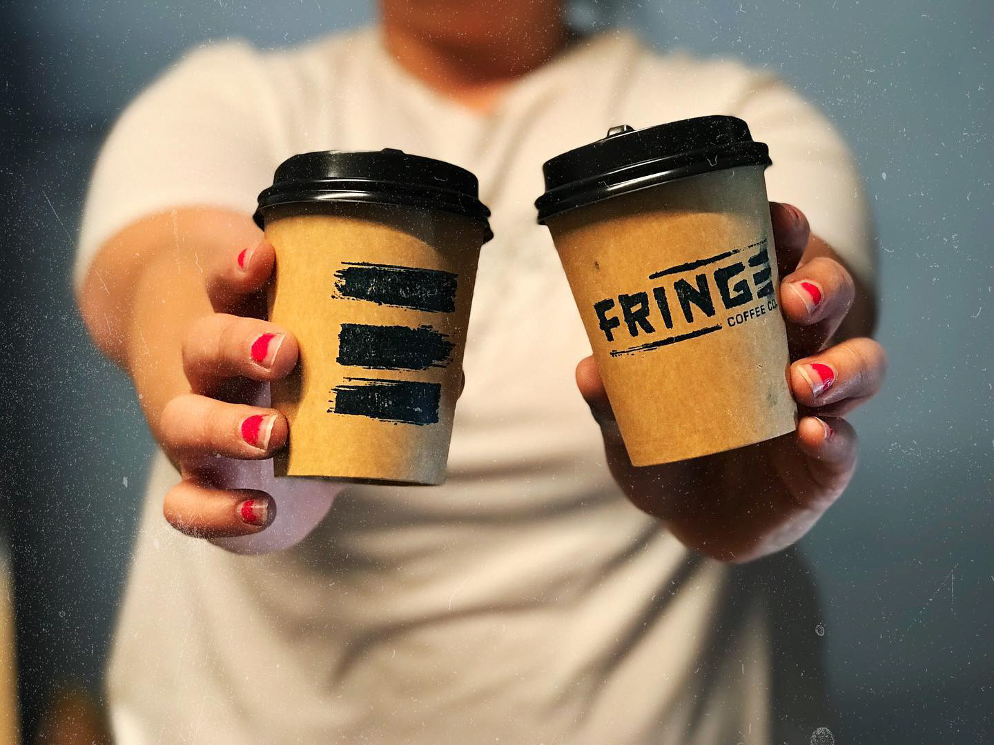
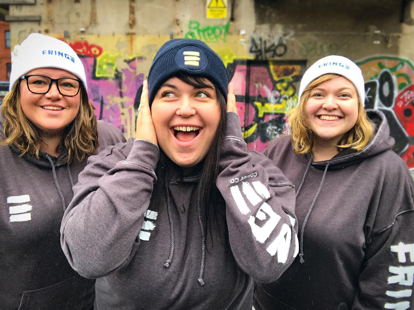
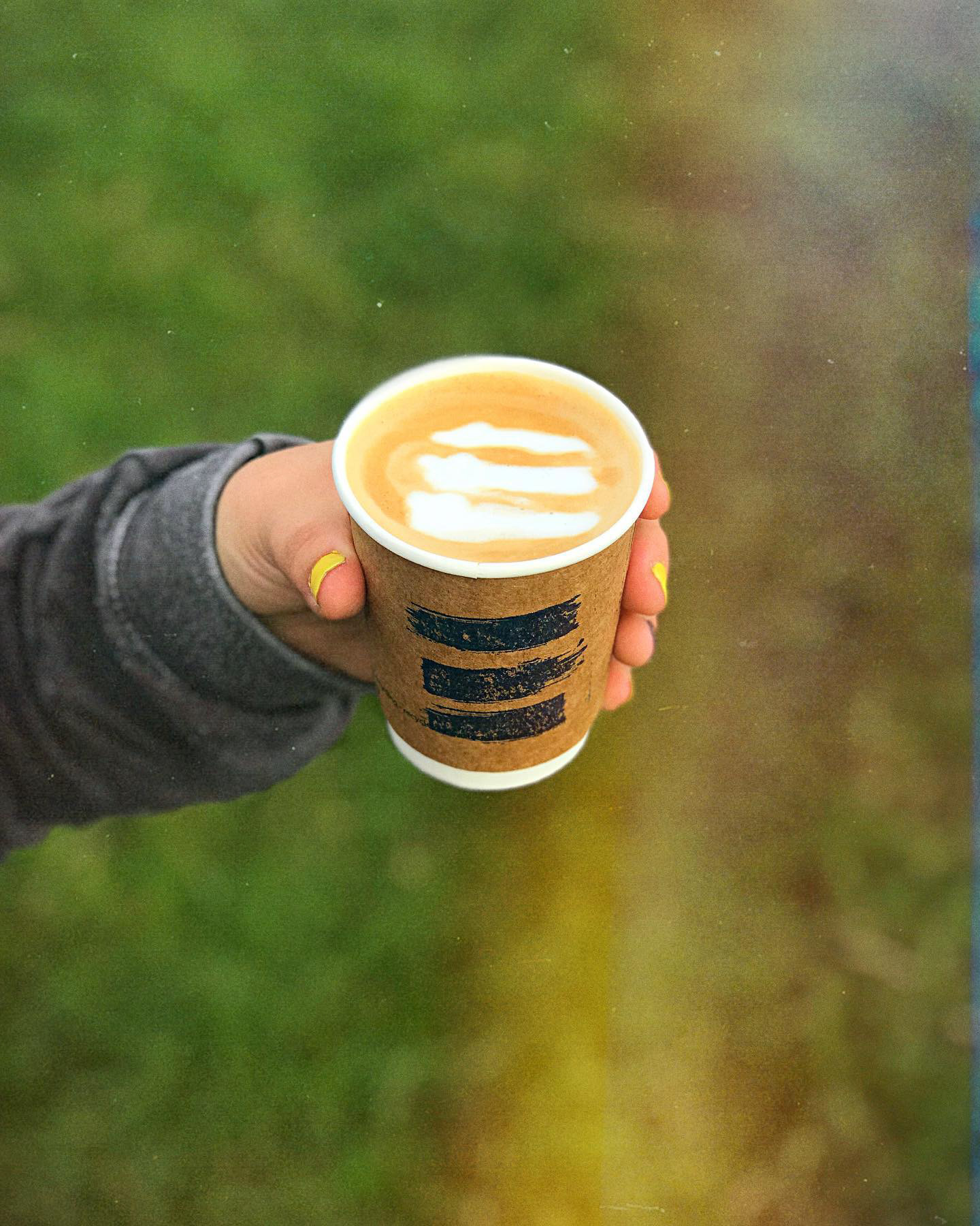
Fringe Coffee Co. is a social enterprise company on a mission to empower people on the fringes of society through coffee. We worked together to create a logo and visual identity that would represent their mission and growing business.
"No Swedish Design"
The Fringe team was tired of the typical coffee shop trend of clean, modern Swedish-style design.
They wanted something creative, future-seeking, and alternative. A logo that could grow with them
and communicated their message of empowerment and belonging while appealing to their core audience; the creatives, the misfits, the disenchanted, and the disenfranchised who were looking for hope. We worked together to craft them a logo and visual identity that spoke to their people and fit their growing coffee company.
Alternate Logo Marks
Colors
Fonts
Assets
Packaging
In need of a flexible packaging solution, we decided on a bag design with interchangeable labels. Icons and colors were used to differentiate between the blends and help to identify the difference when displayed together.
